By Peter Gleick, President
Here are three iconic graphs (unfortunately, there are many, many more) showing just some of the clear observational evidence that we’re changing the climate.
The first is the atmospheric concentration of carbon dioxide, measured at the Mauna Loa observatory in Hawaii. It shows the little ups and downs in concentration that varies with the seasons,
but also the inexorable rise in this powerful greenhouse gas. There are now thousands of stations measuring these gases.
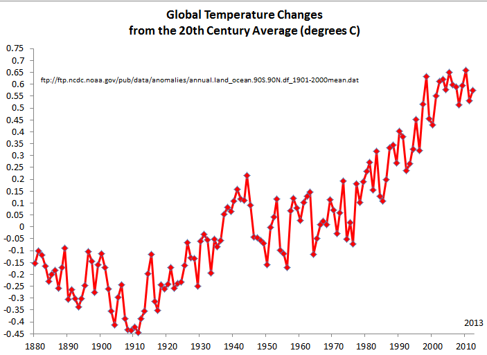
The second is the deviation from global average temperatures over the past 130 years. It also shows the natural variability (ups and downs) of temperature, together with the disturbing rapid rise that scientists say is due to human factors (especially, the rise in greenhouse gases shown in Figure 1). The temperature data come from NASA’s GHCN-M version 3.1.0 dataset. Again, there are other global datasets. They all show the same thing.
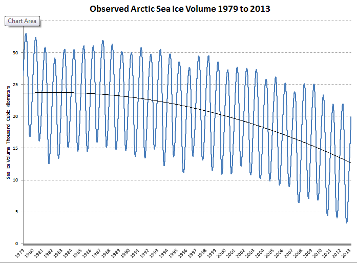
The third graph is the volume of ice in the Arctic (extent and depth together give you total ice volume), showing the rapid decline is the Arctic ice cap — far more rapid than even conservative scientists expected (“conservative” in the non-political sense). These data come from the PIOMAS Polar Science Center.
Read ‘em and weep.
[UPDATE NOTE: On April 4, I updated the second graphic with the latest (through 2012) combined land/ocean temperature anomalies. The overall trend is unchanged. I would also note, there are other datasets from research groups around the world, all of which show the same trends. Thanks to Richard (see comments below) for calling attention to the newest data.) The data come from: ftp://ftp.ncdc.noaa.gov/pub/data/anomalies/monthly.land_ocean.90S.90N.df_1901-2000mean.dat.


